The Map Loads. Our Confidence Doesn’t. I become listless.
The map loads, but confidence does not. When search feels slow or unclear, I stop comparing homes and start wondering whether the page is helping.

In the first article, I wrote about why the map should sit much closer to the centre of property search. A listing can tell me that a flat exists, what it costs, what type it is, and whether it is worth opening. The map answers the harder question: what kind of life sits around it? That is where the MRT, the food options, the bus routes, the roads, the parks, and the places I already care about start to become part of the decision.
But once the map becomes important, it is no longer enough for a portal to simply have a map accessible somewhere. The map has to behave like part of the search itself. If it feels sluggish, loosely connected, or treated like a decorative widget, it does more than underperform as a feature – it makes the whole search feel less certain.
I used to think of trust in housing search mostly as a data problem: whether the listing is accurate, whether the address is right, whether nearby amenities are represented properly, whether the information is current enough to support a serious decision. However, I have become more convinced that trust is also shaped by interface behaviour. It comes from whether the search feels steady enough for me to think through a comparison without repeatedly checking whether the interface has kept up.
That may sound subtle, but it becomes obvious the moment a buyer starts using a map seriously. Housing search is rarely a single neat query followed by a final answer, it's usually an exploratory process. I may begin with a rough budget and a few areas in mind, then gradually adjust once I see what those areas actually offer. I may compare one block against the next station over, revisit a flat I first dismissed, or realise that a slightly less obvious option makes more sense once the surrounding context is visible. The search changes because the buyer is learning while they search.
That is why map behaviour matters so much; It is helping the buyer think, alongside showing spatial information.
An after-thought map asks me not to use it
A map can be present on a property page and still feel strangely absent from the actual workflow.
This is the experience I keep noticing on property portals that technically include spatial context, but do not seem organised around it. The list has one state, the map seems to have another, and the nearby information sits on an entirely different page. A selected listing does not always make its matching location obvious, just like how a selected location does not always make its matching listing obvious. Filters may refresh one surface before another, so the buyer ends up wondering which part of the page reflects the search they just performed.
Nothing needs to look dramatically broken for the problem to appear. The map can still load. The pins can still show up. The results can still exist. But the interface starts to feel like a set of adjacent modules rather than one coherent, fluid search surface. So instead of using the tool to compare homes, they begin monitoring the interface itself, trying to confirm whether the page is in the state they think it is in.
Detached & inconsistent viewing experiences
This is one reason a weak map can sometimes be more frustrating than no map at all. If there is no spatial layer, I know I need to open another map and do that work elsewhere. If there is a weak one, I am first invited to rely on it, then I start doubting if it's useful, and finally I'm forced to decide to whether to abandon it.
There is an older human-computer interaction idea behind this. Direct manipulation works best when the objects I care about remain visible and my actions produce quick, intelligible feedback [1]. In property search, those objects are not some abstract random interface elements. They are exactly, and precisely the flat, the block, the selected area, the nearby transport, the neighbourhood, and the alternatives currently under my comparison. If those things do not move together cleanly, the product starts asking the buyer to do the coordination work manually.
That, to me, is the real failure of a bolted-on map that fails to integrate seamlessly with the rest of the search experience.
Performance is part of trust
Once the map is part of how a buyer thinks, speed stops being just a technical concern.
A slow pan, a hesitant zoom, or a delayed refresh does more than waste a moment. It interrupts the exploration while it is still forming. If the map drags behind the hand, or the results list updates just late enough to feel out of sync, the buyer’s sense of continuity begins to fracture.
In a map-based housing workflow, buyers are testing possibilities in real time. They move east a little to compare the next cluster of blocks. They zoom out to understand whether another MRT stop changes the picture. They narrow their budget, re-open a listing, and try to keep several trade-offs alive at once. These are very ordinary gestures of spatial comparison; that's how I use Google Maps to find my next lunch spot.
When the interface is slow, those gestures start to feel heavy and expensive. The buyer drags less freely, checks fewer nearby options, and becomes more cautious about exploring beyond the obvious. As a consequence, irritation starts setting in and search behaviour begins to change. That interface that should've supported better comparisons is training the buyer into doing less of them.
Exploration either stays alive, or turns into stuttering, or worse – long waiting
There is good research behind this. Work on dynamic queries showed long ago that rapid visual feedback helps people refine a search while they are still learning from it [2]. Broader usability guidance on response times makes a similar point from another angle: once delay becomes noticeable, the interaction stops feeling direct and starts feeling interrupted [3]. In housing search, where the buyer is comparing expensive, highly personal decisions, that shift carries more weight than it would in typical, casual browsing.
This is why I think performance is part of trust.
The interface may be backed by accurate data, but if the visible state feels delayed or unstable, the user experiences that as uncertainty. That kind of doubt is easy to underestimate because it rarely looks dramatic. It shows up as hesitation, repeated checking, and becomes that small mental step of no longer taking the interface at face value, if at all.
Paid surfaces change how I read the page
The problem on many property portals is that too much of the screen is not organised around the intent for comparison.
Results share space with modules, badges, recommendations, discovery surfaces, and other calls for attention that may each be defensible on their own, but together make the page harder to read as a serious decision tool.
Though, there is another layer to this that is worth stating plainly: property portals are marketplaces. It's not realistic, and not especially fair, to pretend otherwise.
Agents and sellers want visibility. Platforms need revenue. Promoted placements, recommendation surfaces, and paid visibility are not automatically bad. In some cases they may even help buyers find relevant options they would otherwise miss. The issue comes when commercial logic and comparison logic become visually entangled.
Once that happens, the buyer starts reading the page defensively.
Their concerns now include, Why is this flat being shown to me?. Is it because it matches the search? Because it is nearby to one I checked out just now? Because it is similar in price? Because it is popular? Because someone paid for the slot? Or even perhaps several of those things are true at once. Point being: the burden should not fall on the buyer to reverse-engineer reasons from layout alone.
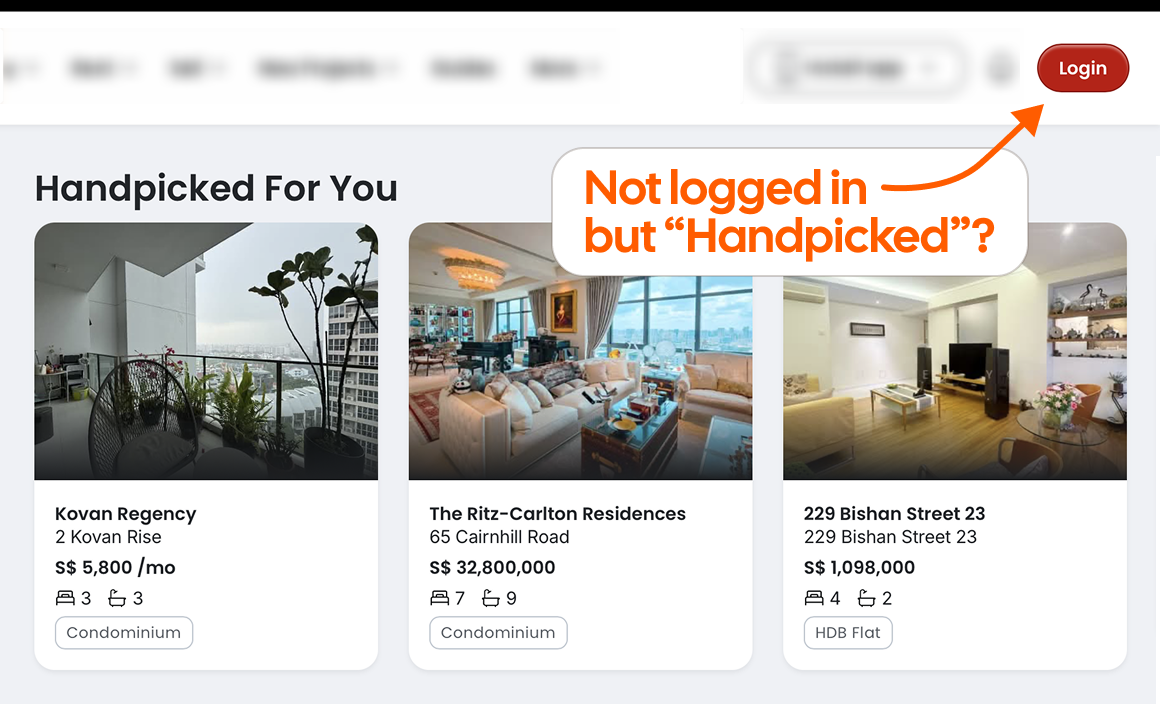
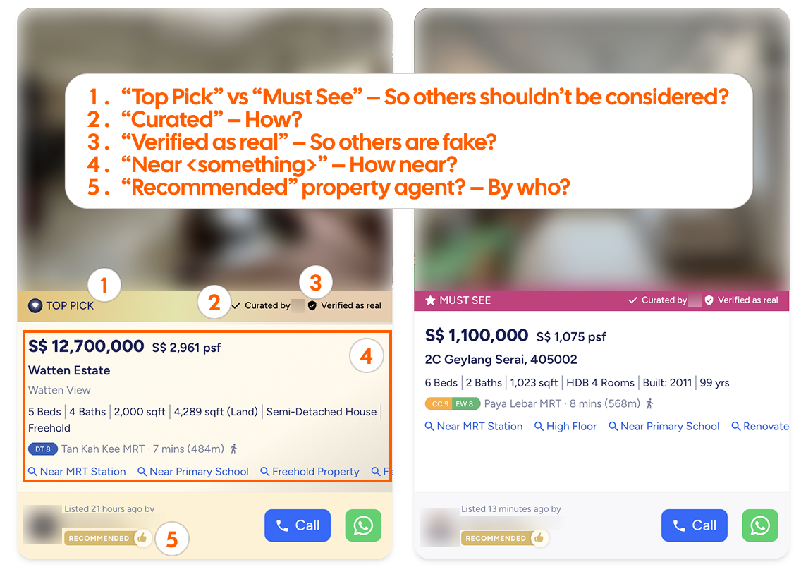
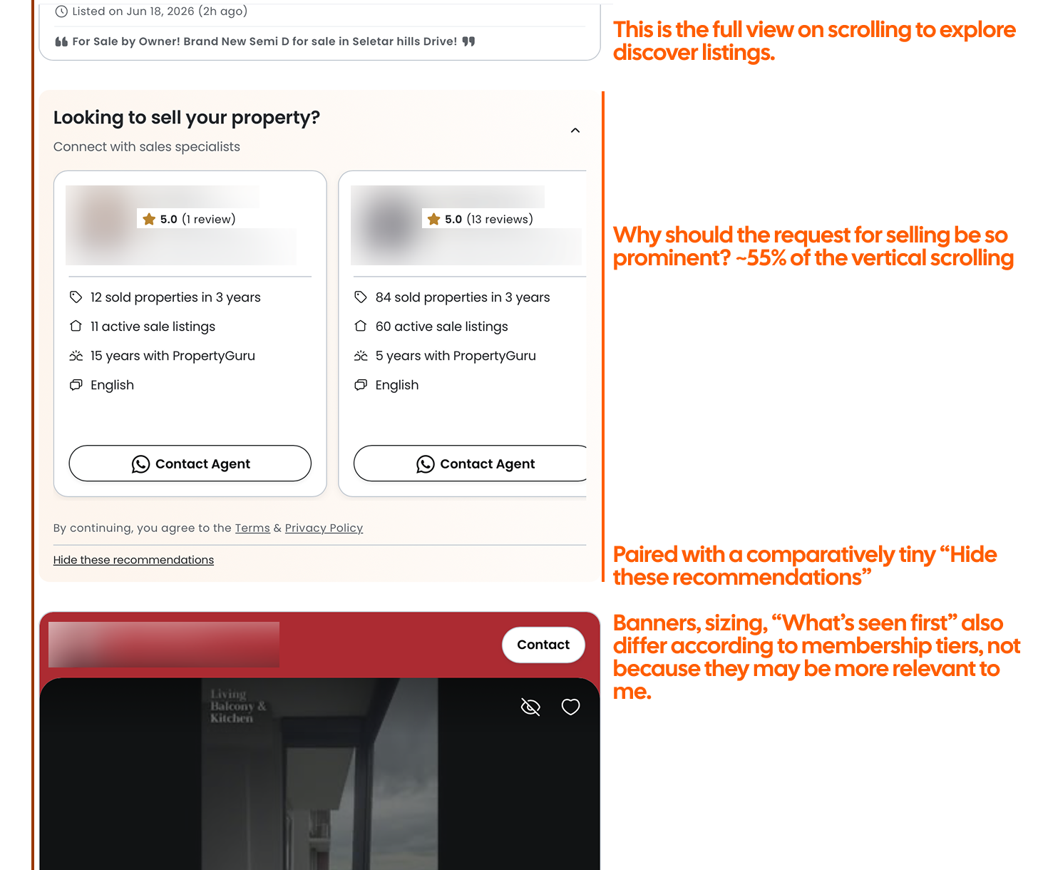
Are these promoted listings even relevant to me?
This is why advertising and disclosure research feels relevant even outside classic ad-heavy web environments. The basic principle travels well: when content has a commercial basis, users need enough clarity to understand how to read it [4]. Search-ad disclosure research also suggests that people can miss or misunderstand paid-result labels when those labels are not clear enough [5]. In a serious home search, that matters even more, because attention is already under pressure.
We should not have to spend extra effort disentangling relevance from marketplace incentive.
Recommendations should explain themselves
Recommendations create a slightly different problem from promoted placements.
A promoted listing raises questions about visibility and disclosure. A recommendation raises questions about true relevance. In both cases, the buyer is trying to understand why something has appeared in front of them, but the kind of explanation they need is different.
Recommendations are useful when they faithfully act as better-shaped alternatives. If I am looking at one flat, there may be genuine value in surfacing another that is slightly newer, slightly larger, better connected by bus, or closer to a place I care about. But once a recommendation that falls outside of our hard requirements without a reason, it becomes just another card demanding attention.
This is where recommendation quality and information design start to meet. A long explanation for each recommendation is not needed; a short and honest reason is often enough: similar price and lease, closer to your saved anchor, slightly further from MRT but larger. None of those labels are especially glamorous, but they are legible, and legibility matters.
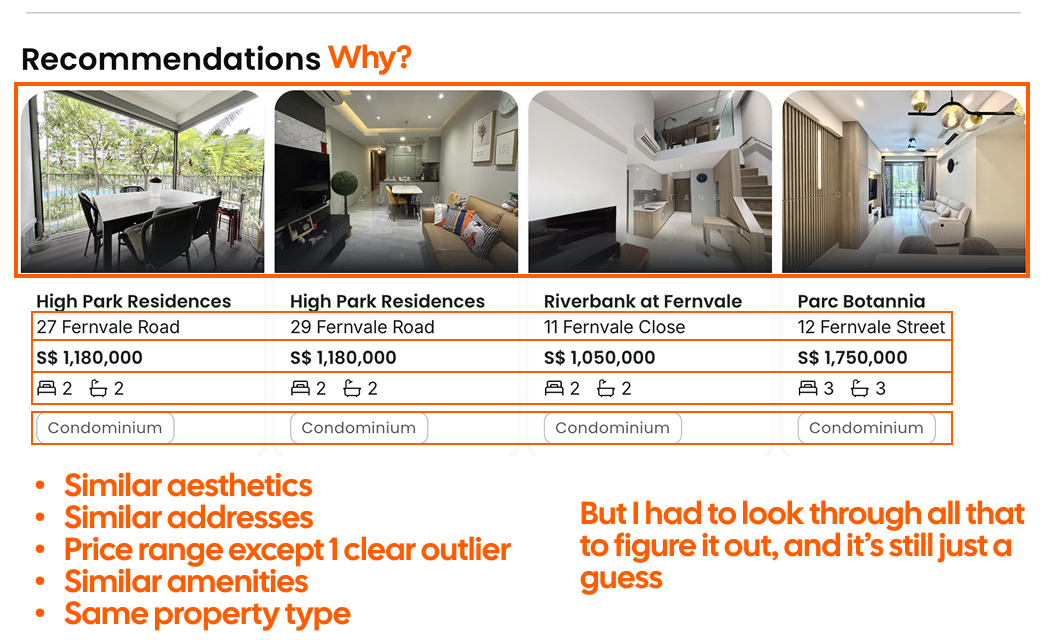
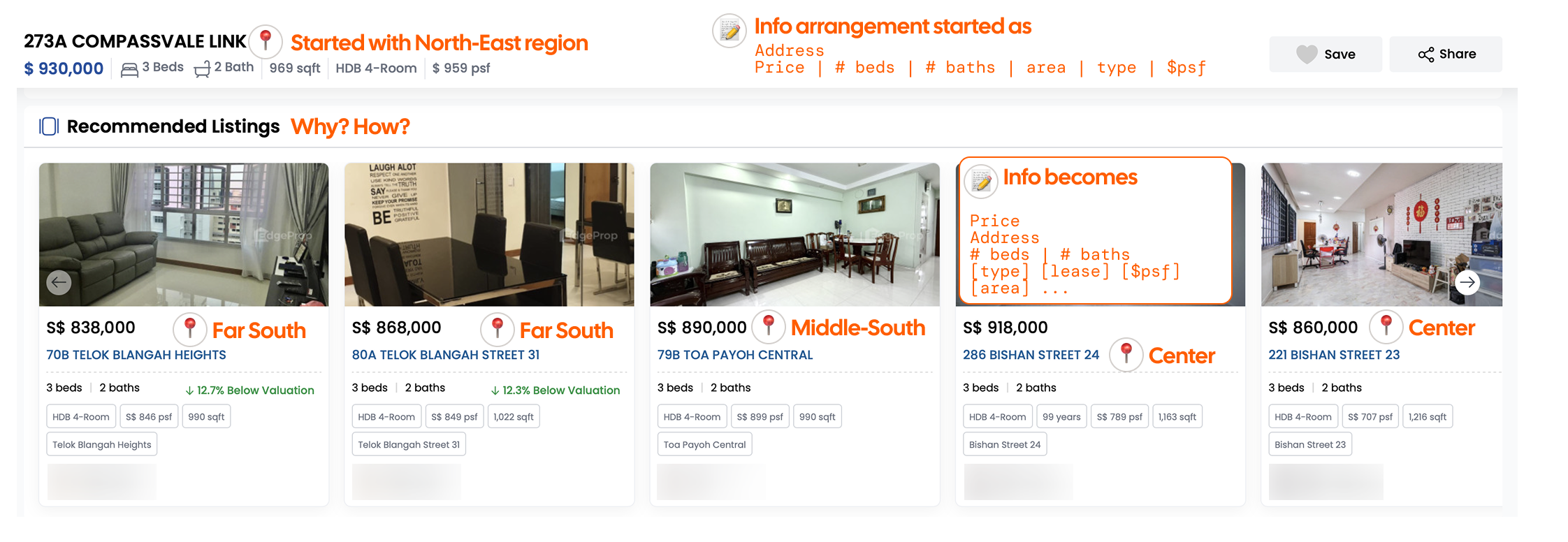
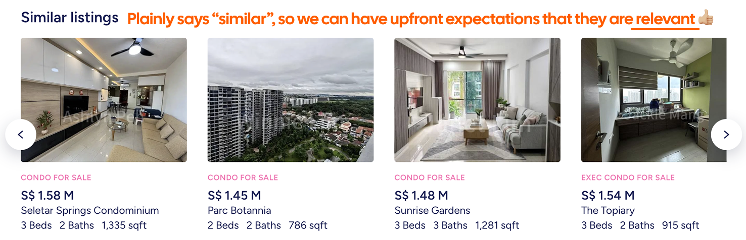
Some are irrelevant, some are valid; always pause and question
Research on decision-focused visualisation often emphasises making alternatives, criteria, and preferences visible so people can compare more effectively [6]. The same principle applies here. If a product introduces an alternative, it should also reveal the criterion that made the alternative relevant.
With room for doubt from weak recommendations, we start wondering whether the product even understands our intent, and it becomes extra work to distinguish.
What I am building towards
I do not think better housing search comes from pretending the decision is simple. Housing decisions are complex. The job of the product is not to erase that complexity, but to carry more of it honestly and coherently. If the map is central, it should share state clearly with the list. If the interface is dense, that density should be shaped around comparison rather than distraction. If something is promoted, the buyer should be able to tell. If a recommendation appears, it should explain its relevance. If the buyer moves through the map, the response should feel immediate enough that the search remains a living line of thought rather than a stop-start sequence of checks.
Much of it is about reducing hesitation: clearer selected states, steadier map behaviour, calmer cards, better loading cues, more honest labels.
Fewer moments where we have to wonder if this page is really helping us. More moments where we can depend on the tools given to us.
[ref:1]: Shneiderman, B. (1983). Direct manipulation: A step beyond programming languages. Computer, 16(8), 57-69. https://doi.org/10.1109/MC.1983.1654471
[ref:2]: Ahlberg, C., Williamson, C., & Shneiderman, B. (1992). Dynamic queries for information exploration: An implementation and evaluation. CHI '92 Proceedings. https://doi.org/10.1145/142750.142751
[ref:3]: Nielsen, J. (1993). Response Times: The 3 Important Limits. Nielsen Norman Group. https://www.nngroup.com/articles/response-times-3-important-limits/
[ref:4]: Federal Trade Commission. (2015). Native Advertising: A Guide for Businesses. https://www.ftc.gov/business-guidance/resources/native-advertising-guide-businesses
[ref:5]: Lewandowski, D., Kerkmann, F., Ruemmele, S., & Suenkler, S. (2017). An empirical investigation on search engine ad disclosure. arXiv. https://arxiv.org/abs/1710.08389
[ref:6]: Oral, E., Chawla, R., Wijkstra, M., Mahyar, N., & Dimara, E. (2023). From information to choice: A critical inquiry into visualization tools for decision making. arXiv. https://arxiv.org/abs/2307.08326
