I Can See the Listing. I Still Can’t See the Place.
The listing tells me a flat exists. The map helps me answer the harder question: where is this block, really, and what kind of daily life sits around it?

A listing can show me a property without helping me understand the place.
That is the gap I keep running into.
The unit matters, of course. Price matters. Floor, lease, layout, photos, condition — all of that matters. But a resale decision sits inside a daily routine. The station I would actually use. The bus stop I would fall back on when it rains. The place I can buy dinner after work. The clinic nearby when someone falls sick. The park I might walk past on weekends. The other places in Singapore that already matter to me.
So I still start on existing property portals, because that is where the listings are. There is no point pretending otherwise (for now?). But once a listing catches my eye, I often find myself doing the real work somewhere else.
I am asking, “Where is this block, really?” And after that: “What kind of life sits around it?”
The real search starts after the listing appears
A listing card is useful because it shows inventory, what it has, roughly what it costs, and whether it is interesting enough to click into. But that's the easy part.
The First Layer of Friction: the listing gives us the property, but we still have to reconstruct the area.
Very often, the address does not mean enough at a glance. A block number and street name might be technically precise, but unless I memorise every nook and cranny of Singapore, I still have to click in, scroll down and find the embedded map, or open another map separately just to understand where the property actually is.
The Second Layer of Friction: a disjointed interface to see facilities in your neighbourhood near your property.
Even when a platform includes a map or neighbourhood widget, the information around the property is often split into separate pieces. Transport in one tab. Schools in another. Food somewhere else. Parks somewhere else again. And so on...
Each tab may be useful on its own, but daily life does not happen in isolated tabs.
I do not just want to know whether there is an MRT nearby. I want to know where the MRT is relative to the bus stops, the food options, the park, the main roads, and the other places I care about. I want to see whether the neighbourhood works as a whole.
When those pieces are separated, I end up doing the stitching myself.
The hidden work is memory work
The more I thought about this, the more I realised that a lot of property search is memory work.
I am trying to remember where the station was after switching to the schools tab. I am trying to remember whether the food options were north or south of the block. I am trying to remember if taking a stroll at the park was actually convenient, or just "nearby" in a technical sense.
It may sound small (or a skill issue), but it adds up quickly when comparing several properties in different areas.
This is where a map becomes more than a visual aid; it externalises the remembering. It lets me keep the property, the transport, the amenities, the roads, and my own personal anchors in view at the same time.
There is a more formal research way to say this: maps and geovisualisation can help people explore spatial information and support decision-making [3]. But the plain version is simpler.
I should not have to hold the whole neighbourhood in my head.
Everything I care about are in separate views. Let's see how many locations I can remember...
“Nearby” is too shallow
A lot of property search language depends on the word “near".
Near MRT. Near food. Near schools. Near amenities. But how "near" is it realistically?
There is an old idea in geography that nearby things tend to matter more than distant things [1]. That feels obvious when buying a home. The things around a property shape the daily experience of living there.
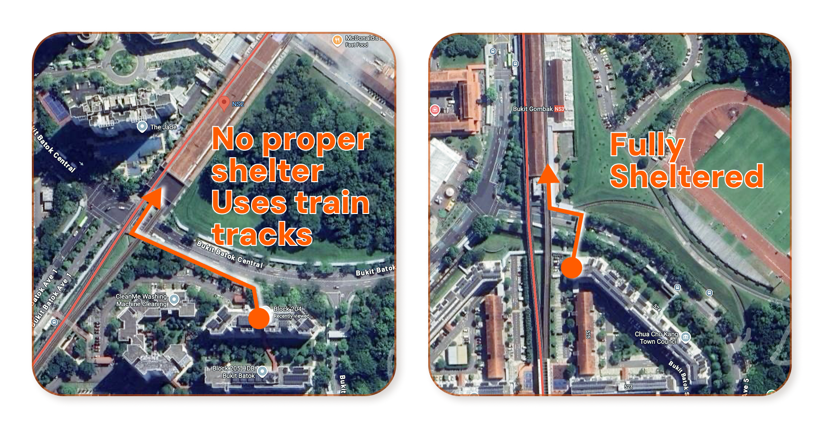
A property can be near an MRT station and still feel inconvenient if the walking route is exposed, awkward, dirty, or full of crossings. It can be near food, but the food might be in the opposite direction from the station on your way home, which changes whether it fits naturally into a weekday routine. It can be near a park, but that does not mean the park becomes part of your life if it sits across a road you rarely want to cross.
This is why I find simple distance labels slightly unsatisfying.
We should also consider “in which direction?”, “along what route?”, “next to what else?”, and “does this fit the way I actually move?”
The places that matter are not the same for everyone
This is also why I prefer thinking in terms of personal anchors.
For some people, that anchor might be their parents’ place. For others, it might be a partner’s workplace, a child’s school, a mosque, a gym, or simply an area they keep returning to.
The important point is that buyers evaluate it from our own existing map of life, not out of nowhere and seeking a completely new way of living.
Truth be told, that existing map is messy. It does not always follow estate boundaries. It's unlikely to fit neatly inside a 1 km radius. It may stretch along a train line, cluster around family, or depend on a few weekly routines that are hard to express in a static filters.
This connects with an idea in geography called the “uncertain geographic context problem”: the meaningful context around a person is often not the same as a neat boundary or a simple radius [2]. I like that framing because it matches how housing search actually feels.
A neighbourhood is the area that becomes relevant because of how someone lives, not some arbitrary polygon around the property.
Singapore makes this especially visible
Singapore is small, but our housing decisions are still deeply spatial.
A few stops on the MRT can change a commute. A bus connection can make one block feel more (or less) convenient than another. Familiar stalls in coffeeshops can make a new estate feel less foreign. Being near a place you care about can be the difference between “possible” and “actually liveable”.
There is also research on residential search and location choice in Singapore that points in this direction. In one study, spatial variables like distance to work, distance to parents, distance to close contacts, distance to top primary schools, and proximity to MRT were considered relevant to how households form and evaluate housing options [5].
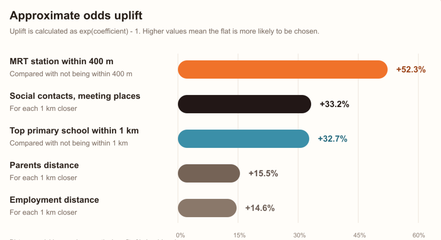
Consider it as support for something buyers already know intuitively: a home decision is tied to a personal geography.
What is each category nearby really doing?
The nearby layers are not there just because maps look better with more pins. Each layer answers a different buyer question, I penned down some examples I feel are relevant:
MRT and bus stops are about daily movement. Not just whether transport exists, but whether the routes feel natural enough to use repeatedly.
Food and hawker options are about convenience that shows up again and again. The kind of convenience that seems minor until a long workday.
Schools and childcare are about routine pressure. Pickup, drop-off, timing, and the shape of family logistics.
Clinics and pharmacies are about support. They are not exciting features, but they matter when they need to matter.
Parks and open space are about breathing room. They change how an estate feels outside the property itself.
Town centres and errand clusters are about whether multiple small tasks can be done in one trip.
Roads and noise are about the parts of the living environment that listing photos rarely explain well.
And personal anchors are about the places that matter because they are yours.
This is the part I want WhereHDB to make easier. Not just showing more information, but helping buyers see how the they all fit together.
The map is where tradeoffs become visible
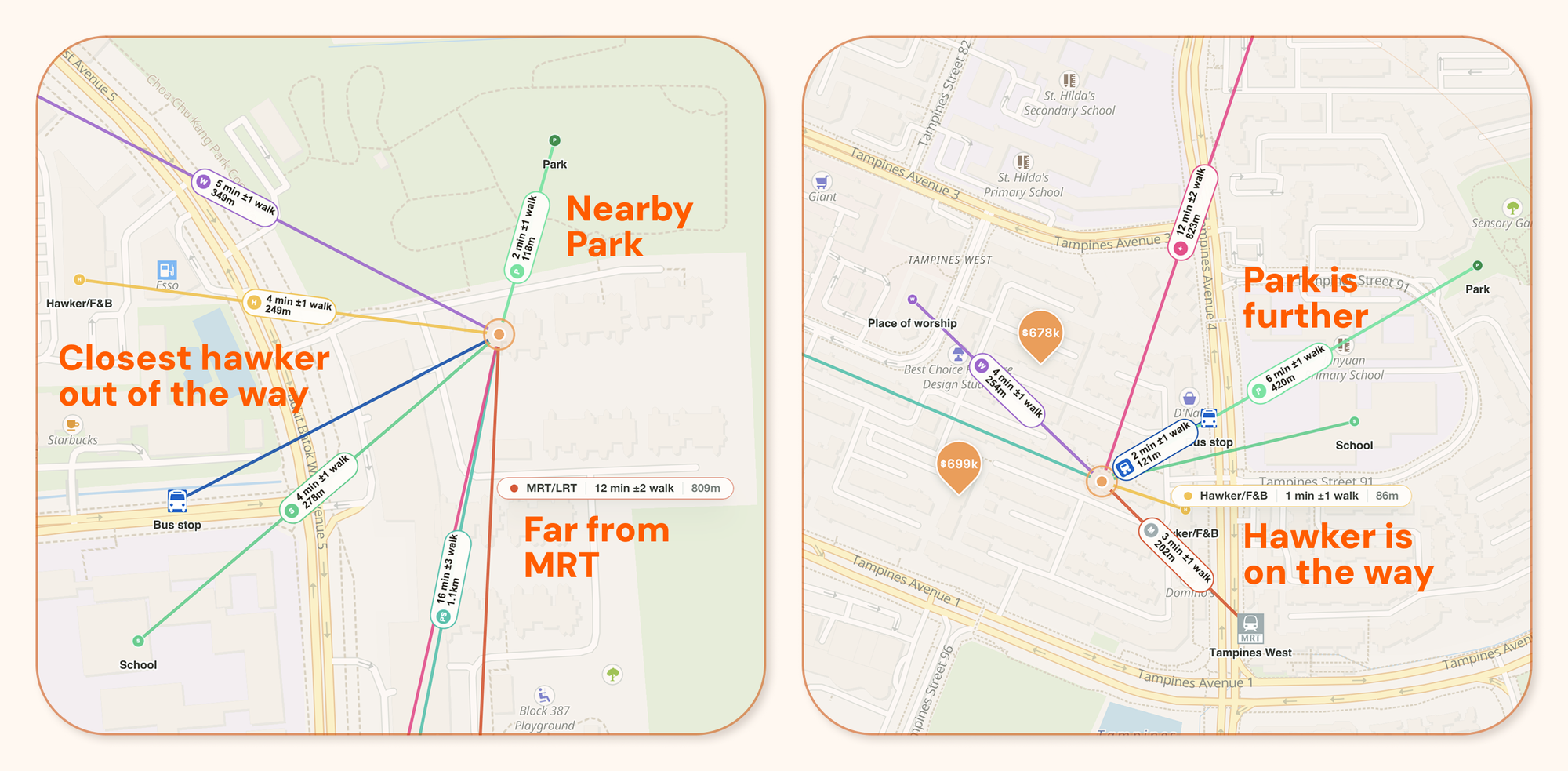
One property may be closer to the MRT but further from a place I care about. Another may be quieter but less convenient for errands. One may have better food options nearby, while another has a nicer walk to the station. On paper, two properties can look almost identical. On a map, they can start to feel very different. That is why I think the map should be much closer to the centre of the search experience.
A list is good for scanning. A card is good for summarising. A filter is good for narrowing. But the map is where the tradeoffs become visible.
Decision-support research often talks about making alternatives, criteria, and preferences visible so people can compare choices more clearly [4]. That is exactly the job I want the map to do here, in a very practical HDB resale context.
What I am trying to build with WhereHDB
I do not want the listing to be the end of the immediate search surface accessible. We have the option of extending the searchable dimensions (context) for consideration with maps.
When I look at a property, I want to immediately understand the area around it. I want to see the transport options, the everyday amenities, the roads, the parks, the family or personal anchors, and the small practical things that shape daily life.
Of course, I don't expect a map to answer every part of the home search journey. There are other checks, constraints, and decisions that deserve their own proper treatment (which I hope to deliver sooner than later).
But for this specific problem of understanding the place around the property – the map is the natural interface. We look for things to do on holiday on the map, why not we do the same for finding our new home?
It reduces the amount of data I have to remember. It makes nearby layers visible together. It helps me compare properties as lived locations, not just listing entries.
There is another product question I will write about separately: why map performance, responsiveness, and interface design matter so much once the map becomes central. That deserves its own post, because a slow or awkward map can stop being useful very quickly.
The property is the listing.
The decision is the life around it.
And that life is much easier to understand on a map.
[ref:1]: Tobler, W. R. (1970). A computer movie simulating urban growth in the Detroit region. Economic Geography, 46(sup1), 234-240. https://doi.org/10.2307/143141
[ref:2]: Kwan, M.-P. (2012). The uncertain geographic context problem. Annals of the Association of American Geographers, 102(5), 958-968. https://doi.org/10.1080/00045608.2012.687349
[ref:3]: MacEachren, A. M., Gahegan, M., Pike, W., Brewer, I., Cai, G., Lengerich, E., & Hardisty, F. (2004). Geovisualization for knowledge construction and decision support. IEEE Computer Graphics and Applications, 24(1), 13-17. https://doi.org/10.1109/MCG.2004.1255801
[ref:4]: Oral, E., Chawla, R., Wijkstra, M., Mahyar, N., & Dimara, E. (2023). From information to choice: A critical inquiry into visualization tools for decision making. arXiv. https://arxiv.org/abs/2307.08326
[ref:5]: van Eggermond, M. A. B., Erath, A., & Axhausen, K. W. (2018). Residential search and location choice in Singapore. ETH Zurich Research Collection. https://doi.org/10.3929/ethz-b-000193146
